Time and time again designers have to go above and beyond their role in order to have a true impact to their customers’ experience.
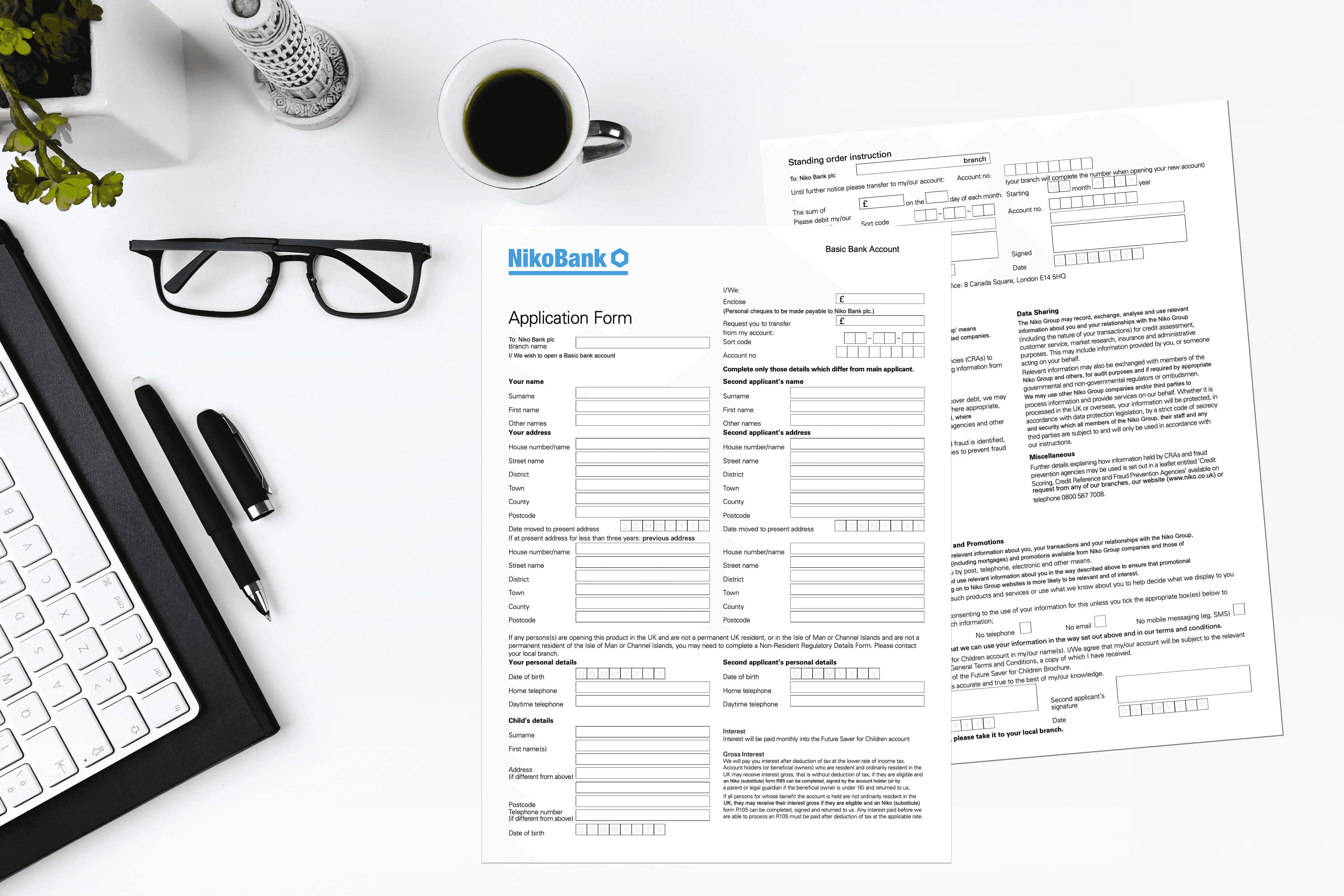
When I was working in a bank, designing the digital customer onboarding journey, I discovered a bug in the system; when customers started an application online and later had to go to a branch to complete the process* many times they had to do the application twice, they filled a form online and one more in branch, this time on paper.
What was the reason this was happening ?
There was a conflict of interest between the different channels. Digital and branch.
The employees of the bank working in the branch would be rewarded for every new customer that opens an account but not if these customers had started their application online (digital referral to branch). These applications were counted for as revenue generated from the digital channel.
As the bank employees were aware that they would not get any bonus for customers that already filled their application online, they would discard the data that was provided by the customers already via the website and ask them to do it again.
After spending almost 2 hours answering 60+ questions* online, customers were told to go to the branch to complete their application by presenting their identity documents and signatures. But instead of that, the employee would ask them to fill in a an application again from scratch, this time in paper form — which actually had even more questions. Some of the questions asking for the same piece of information, but phrased differently, would cause confusion to customers that they had already answered a very similar question previously on the bank’s website.

What a great customer experience!
A process that was promised to be easy and be completed within the same day (as was highlighted on the website), it was turning to a much longer one as they now had to go through the traditional, older branch account opening process which would require different information and therefore in many cases will mean that the customers would require to leave the branch and return multiple times before they managed to get all the required documents and information.

I guess you can imagine the frustration of those customers…
Of course the management wanted to have a clear view of the revenue source Digital vs Branch, so they had somehow to separate and attribute some of the acquisitions to the channels from where they had originated…
The problem was that the KPIs and reward systems that were engineered to ensure revenue generation for the bank were set in a way that promoted behaviours that compromised the end customer experience.
Somebody had to change the employees reward system, or somehow make those employees put the customers experience first. I had to speak with the COO’s office, the branch managers and HR even, in order to change this situation.
This is when I realised that I should maybe start calling myself a Service Designer instead of UX designer.
In order to have a true impact to your overall customer experience, you have to design and re-engineer not only the product, interface and user journey, but the organisational structure, ways of working KPIs and revenue streams. This is called Service Design.

* In some countries i.e. Mexico, a straight through online journey was impossible, as local regulation requires customers to provide their fingerprints and wet signature in order to open a bank account. Therefore customers had to start online and finish in branch (cross-channel journey).
* The original account opening application had 62 to 74 questions, depending on the country and the customer’s answers. After our work we managed to reduce the number of questions to 19 (at the best case scenario).
Go Back